Skip to content
OpsLab logo
Group 358

acc_bar


product value acceleration

Revolutionizing military pilot logistics training and management.

Overview
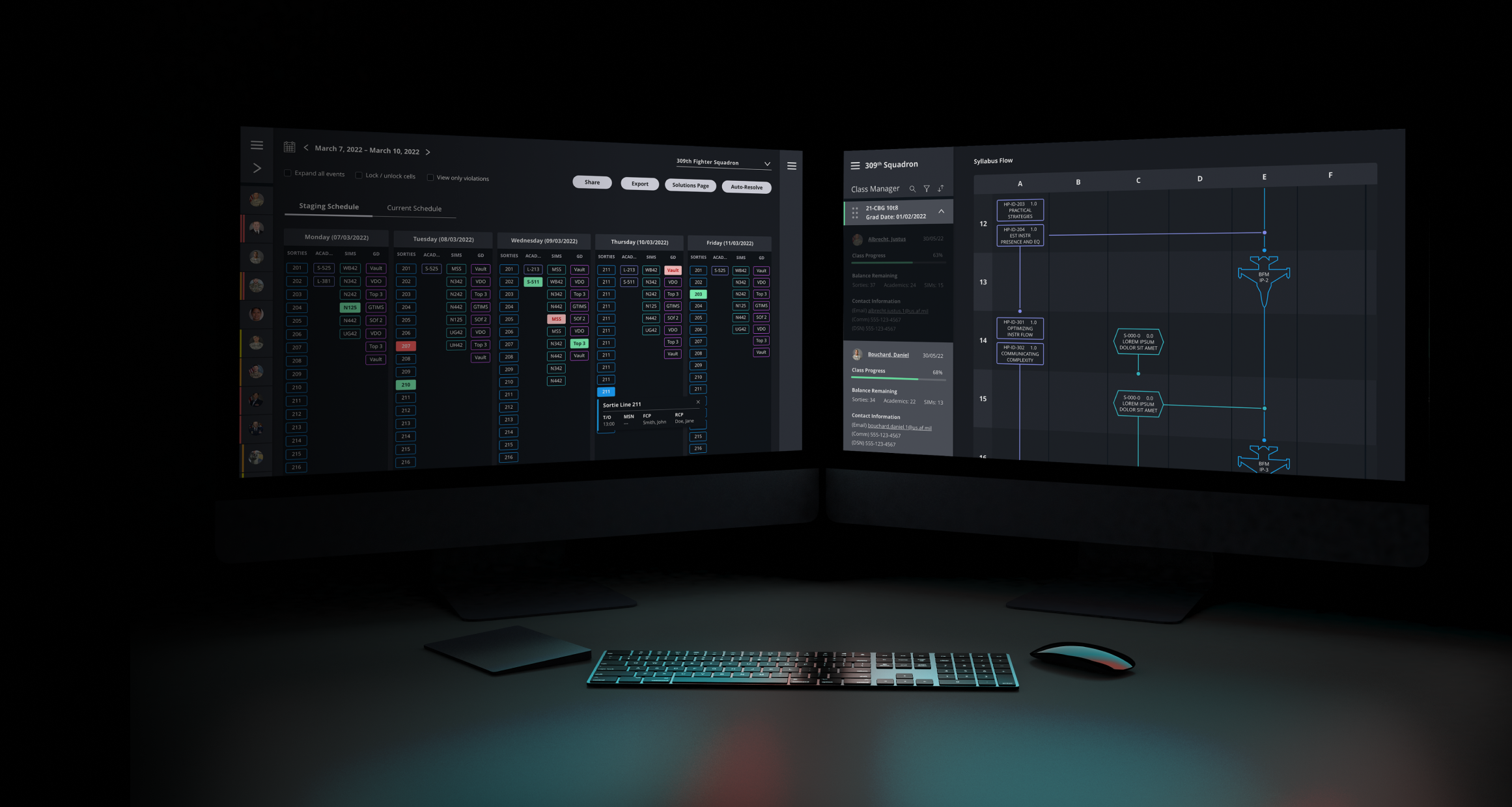
OpsLab partnered with Thinktiv to expand into the defense sector, building on its commercial airline logistics management expertise.

Thinktiv worked alongside OpsLab and its customers in a three-phase product development program. Together, we created the next-generation flight operations management experience.
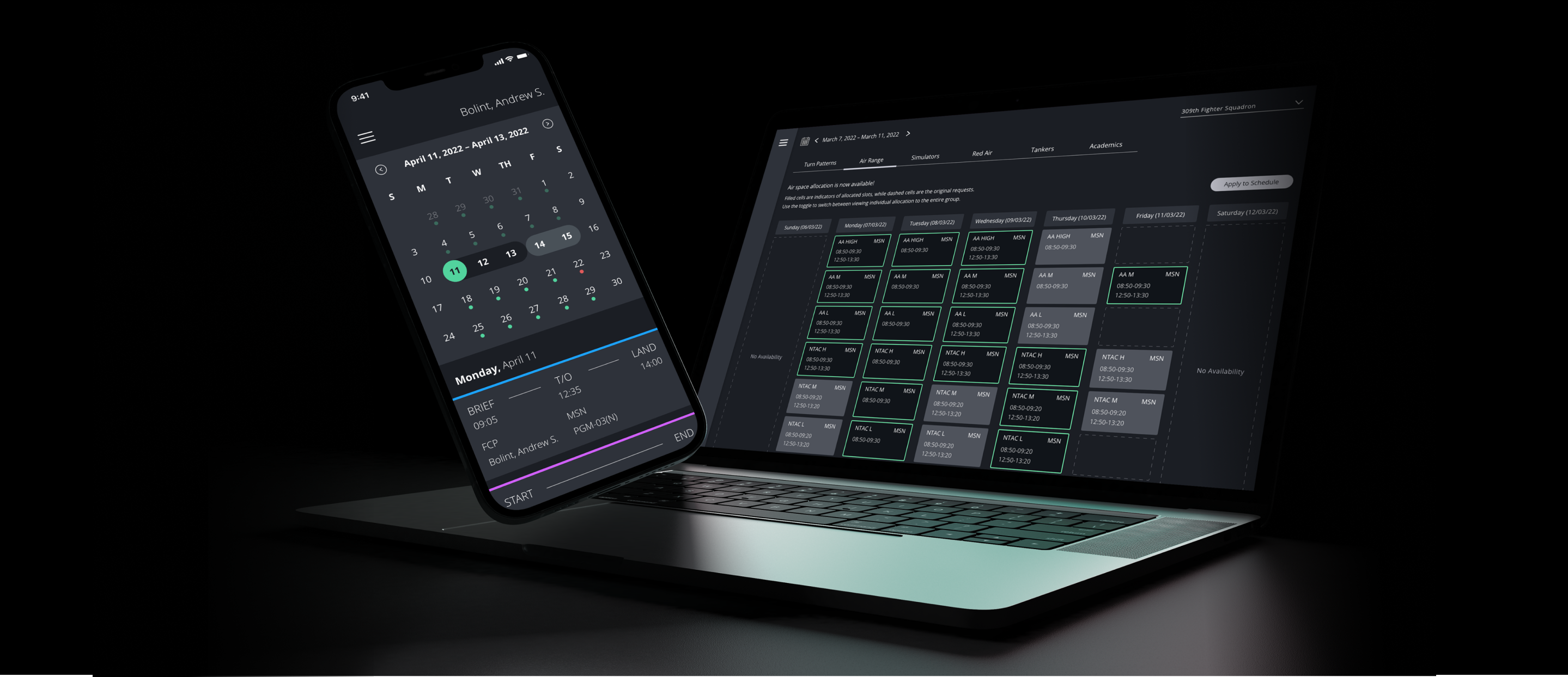
Interface design on mobile and desktop

acc_bar


Challenge
Manual scheduling was grounding new pilots, rather than putting them in the air.
Problems to Solve
The Pilot Transformation Training (PTT) program is a solution to combat the severe pilot shortage, but the lack of accurate technology made the mission increasingly difficult to execute.

Scheduling student and instructor pilots required hundreds of hours to execute as the process used a static, physical board and printed documents, along with lengthy in-person meetings.


Solutions
Thinktiv designed an innovative, user-centric smart scheduling solution.
How We Solved Them
In 6 months, Thinktiv developed a comprehensive UI and UX that layered on top of OpsLab's machine-learning algorithm.

A user-centric design process led to a digitally-enabled, configurable schedule that optimized schedules and syllabi in real time.

The UX was personalized to the experience of different user groups and included multiple tracking and reporting functions.

opslab interface wireframe design
Wireframe Prototyping
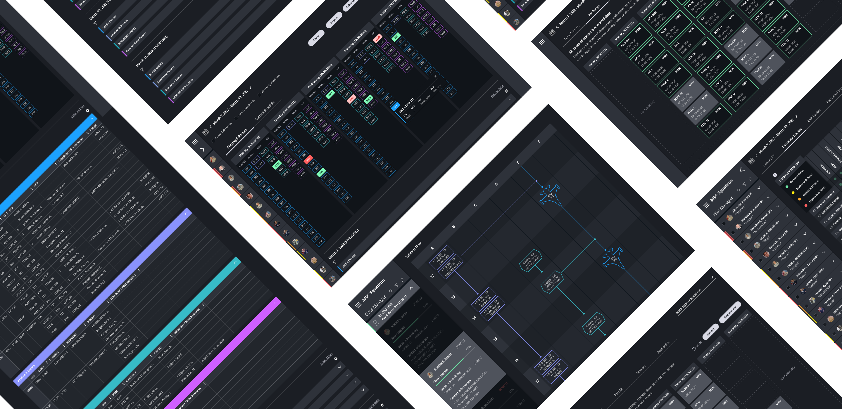
UX wireframes were constructed to satisfy four major user experiences, fully prototyped and with a table of contents linked to individual UX flows.

Each wireframe is componentized as features that satisfy a US Air Force user need. Through every interaction, OpsLab makes getting the job of scheduling done faster and better, at a fraction of the cost to the current pilot scheduling methods.

Like What You See?

Partner With Us

Arrow Button

Visual Design
As most schedulers worked in dark rooms, a dark mode was established for the product UI. The highest priority items were highlighted while other components were darkened to create greater contrast.

Dark mode elevation helped create a visual hierarchy amongst information dense content and reduced eyestrain.

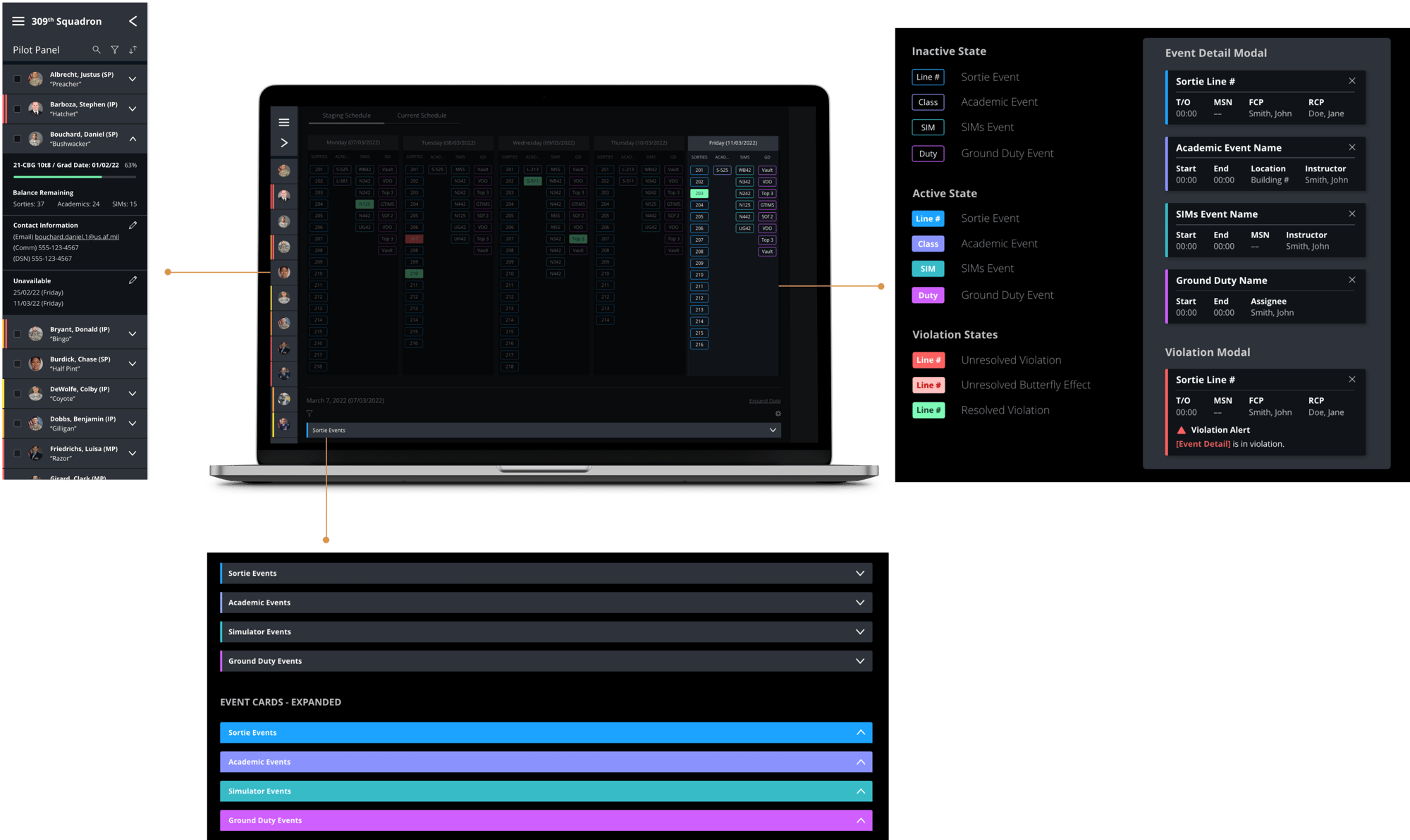
Design System Library
Since there was no existing design system to expand from, every element created was developed into a component and organized into a library.

A design language was built around interaction states, alert systems, and component application, with the goal being to provide a structure for expansion if the OpsLab team decides to add new elements and feature sets.
opslab_system_mockup
opslab product screens

Acc Strip

Impact
Lorem ipsum dolor sit amet, consectetur adipiscing elit, sed do eiusmod tempor.
How We Made an Impact
Lorem ipsum dolor sit amet, consectetur adipiscing elit, sed do eiusmod tempor incididunt ut labore et dolore magna aliqua.
$0M

Metric Caption

$0M

Metric Caption


Want to See More?
Check out these additional engagements
Supplyframe
Structuring valuable assets into a category-winning vision, with a monumental exit.

BVA + Accelerator
supplyframe-card@2x square
CasaPerks
Launching the most disruptive loyalty platform for multi-family renters, owners & operators.

BVA + Accelerator
cp-card@2x square
View More
Case Studies
Arrow Button 2

Contact Us.

Let's talk about the right value creation strategy for your business or portfolio company.